Once the concept for the story had been established the next stage of the process I undertook was the design and development of potential characters. For the purpose of the story we intended to use three pigs, each with their own characteristics or personality that could be portrayed through the use of props, body shape, body proportions, features and expressions. For example, the idea of pigs plotting an escape from a farm would require a pig to do the thinking, or an intelligent character, a pig with the strength and determination to dig them out, and the third pig would be there as an extra and to act as the middle ground in terms of personality and to find a balance in the personalities featured in the story. I made sure to show my work and designs to Wing as often as I could in order to make sure she approved of the ideas I had and we could move forward, which fortunately she did! I used a mix of traditional and digital media in order to find an appropriate style and medium to portray the characters. With traditional media, I used a mixture of pencil, pen and charcoal to create block silhouettes and try to determine the shapes and proportions I thought would work best at portraying the characters in a stylistic and appropriate way considering the context and genre of the story. I found this to be quite helpful and once this stage was complete and I was ready to move forward, I created my more refined designs and illustrations digitally using Adobe Photoshop along with a Wacom tablet. Using the Wacom tablet I strived to create angular and undefined edges on the characters using various brushes such as the chalk brush, to create a textured effect. I think the mixture of digital and traditional media when designing is quite important as each serves it's own unique purpose and has their advantages. In this case, the accessibility and ease of access of traditional was great to get my ideas onto paper using pen and pencil, whereas the digital side was more for refining what I had done up to this point and adding colour, experimenting etc. During the design process reference material was a huge influence in developing the characters. There was a difficult mix of creating the characters for this particular animation because they had to have a simplified design that could comply with mine and Wing's ability on Maya, in other words be simple enough for us to be able to model them to a high level and to an accurate degree. Secondly, the characters had to fit the style we were hoping to achieve, so block shaped with sharp bodies with oversized proportions to demonstrate a level of 'cuteness' and the friendly nature we wanted the characters to possess, showing the audience they meant no harm and ultimately were likeable to a degree where the audience engaged with them. Finally, making them actually look like pigs, even before colouring we wanted to make sure they had the telling characteristics of actual pigs, so plump bodies, short limbs, beady eyes and a round snout - these in some cases are exaggerated for the purpose of the design aesthetic, but all in all we wanted to achieve a certain level of familiarity and likeability with our characters that came across immediately, especially since the animation is only one minute long - so hopefully they leave a lasting impression.
I tried to do some simple drawings based on the anthropomorphic style pig I had in mind, I included a few varied poses to get an idea from the different angles and to obtain a fairly good idea about the bod shape and posture that would most suit.
After the initial sketches I wanted to pad out the design, so I took my idea into Photoshop and developed it further using all the ideas and requirements that I listed above. I tried to play around with a couple of poses and try to develop a personality and back story for the pigs - like Sara mentioned in her lecture on character design. I also played around with colours although I changed the arrangement of colours several times until I was happy with it and enjoyed experimenting with different layers and layer settings in order to achieve various lighting arrangements on the pigs body, giving the character a slightly new feel and a 3D feel. The addition of props such as at the spade, in conjunction with the poses I created the pig in bring the character to life more and are more interesting design ideas to look at. I also tried to add a Fullmetal Jack reference with one of the pigs helmets. Overall the simple design of the pig is what I was trying to create and I'm happy with the angular lines and texture that I was able to achieve in Photoshop, and plan to take the stylised look into the development of the 3D character in Maya.
Thursday 29 October 2015
Wednesday 28 October 2015
OUAN504 - Feature Film Research
Early on in the pre-production process, I took the opportunity to look at an analyse some animated films throughout the history of animation that focus on animals. The three films I chose to look at that seemed to me to have the highest amount of relevant content were Chicken Run, Animal Farm and Porco Rosso - all for different reasons that I thought could be beneficial throughout the creation of mine and Wing's animation.
Chicken Run
Chicken Run is a hugely well known stop-motion animated feature film that was released by Aardman Animations in 2000. This film was an obvious choice when it came to producing research and looking at previous animations because of the narrative it follows. To summarise, the film is about chickens that are being kept on a farm and their plans to escape the farm. This ties in closely with mine and Wing's narrative, which is centred around pigs that are plotting to break out of a barn that they're being kept in. The way in which I have taken influence from this is the chaotic fast paces action scenes all instigated by intelligent animals. I think the concept of this is interesting in itself but the way it's executed in the film is brilliantly done. There are a lot of differences between the way Chicken Run was produced and how we will be producing our animation. Aside from the obvious differences such as character, story and length our animation will be created using the 3D software Maya, whereas Chicken Run was a stop motion feature film. However, there is several things I want to learn from watching and observing the way Chicken Run was made. Firstly, I want to attempt to bring the same charm that flows throughout Chicken Run into our film and despite it only being a very short animation by comparison, I would like to be able to make the audience warm to and enjoy watching the characters go about their plans. I also want to be able to incorporate the same well executed and exhilarating action sequences. Since the majority of the film will be essentially a montage of the pigs trying to dig their way out of the barn they're being kept in. The sequences in Chicken Run have a certain well thought out flow to them, and that's what we're aiming for with our sequences.
Animal Farm
Animal Farm is an animated film that was created in 1955 by British animation Studio, Halas and Batchelor. The film is based on the book by George Orwell, and I've decided to look into the film further to look at way animals were portrayed with a higher intelligence and the ability to talk - as in the film, the animals are essentially metaphors for people. In no way will any of the techniques that were used to make that film be used in the making of ours, however, I think the way the characters are portrayed is a great point of reference when animating animals. They all have their distinct characteristics and you do in a sense forget that they are animals due to the complexity of the character they're portraying. I don't think that we will have the ability to develop characters in quite the same way, especially due to the fact our characters won't be talking or using dialogue. I do want to try and take on a similar sense of movement and expression so hopefully I'll have the ability to do so despite my inexperience using Maya software.
Porco Rosso
Porco Rosso is an animated film produced by Japanese animation studio, Studio Ghibli in 1992. The reason I chose to look at this film in greater detail was to focus on the way the studio handled and went about portraying an anthropomorphic pig in their film. Similar to in all of the films produced by Studio Ghibli the characters and their environments have a huge amount of charm and character that is communicated to the audience through colour, movement and story. The pig in this particular story is only a pig due to a curse as part of the story but it was interesting to see how he was portrayed nonetheless. Its great to see the way he's portrayed in this way as an intelligent articulate and well dressed pig, and I like the character and the way that it's communicated to the audience. He feels like a real person doing real things, which makes me think that as long as you make the character act like a person or a human, then it doesn't matter what the character is based on, in this case an animal for example.
OUAN504 - Telling Tales - Visual Research
The purpose of the visual research I have undertaken for this project is relevant to four specific areas that I thought needed attention when it came to research and colour, mood etc.
So firstly I looked at pigs since they're the main characters of they story. I tried to find a range of reference imagery that included pigs covered in mud, pigs in a pig sty in a type of factory farm environment, and the animals from a range of angles. These images coupled with some other influences were very useful when trying to design the characters for the story. Despite the pigs in the story being anthropomorphic and not being realistic in that sense, when looking at exaggerating features and placement of body parts and proportions the come in very useful. The colours of the pig differ depending on the pig too, so some will have pure pink skin and fur whilst others have brown spots or sometimes even black - so colours is another interesting and useful element to take from the visual research I complied looking at pigs and their housing on a farm.
The second type of imagery I looked into was stills from classic or popular war and prison films. These included, The Great Escape, Band of Brothers, Apocalypse Now, Saving Private Ryan, Platoon, The Shawshank Redemption and Fullmetal Jacket. The reason for looking at this genre of film in detail is for a number of reasons. Firstly, I wanted to make it seem as though the escape the pigs undertake in the story is a military type of operation, making sure to include aspects of this such as the helmets, the idea of a ranking amongst the pigs, perhaps hand signals and really try to parody the idea of pigs escaping using military techniques and wearing helmets etc. Next, I want to include several explicit references within the animation from some of the classic war and prison films. This was an idea I have discussed with Wing, Mat and Sara and we all agree it would be a subtle and humorous addition to the animation. Things such as the disposal of dirt from The Shawshank Redemption via his trouser leg and pocket, or the poster covering the hole in the prison wall. We also wanted to include the scene in The Great Escape where the baseball is being bounced off the wall in his cell. I also collected the images to replicate the mood and lighting shown in these films, with the washed out colours and perhaps also the low key blue and green lighting.
The next collection of images is barns, farms and farmland that could be a huge influence and good reference imagery when trying to build the environments or design them from different angles. The way the buildings are constructed and the colour palette of these mood boards are particularly influential and some of the bright but dark colours could be used in the designs also. Another element of these images that I want to take forward is the vast scale that they display. Fields that go on and on for a while, with row after row of crops with mountain ranges and big open skies in the background - these are the kind of elements that it would be great to incorporate into the animation when setting the scene and introducing the audience to the environment because it gives the story some justification when the pigs are trying to escape and the lengths they go to in their planning. Finally, it helps tell the story from the perspective of the pigs. The unknown outside and the fact that they're a lot smaller than humans could make the vast farm environment seem a lot more intimidating and therefore by putting emphasis on the size of the farm it helps demonstrate that fact to the audience.
The final mood board I created for the purpose of visual research was all about mood and lighting. I tried to retain the rural farm environment for some of the images but in general it was more about low key dusk lighting that I want to incorporate into the animation. Since a lot of the story takes place at night when the pigs are trying to break out, it's essential that the correct mood and lighting is captured to put forward the nature of the escape and illustrate the tension in the story. I tried to gather silhouettes, dark skies, late sun sets and large cloudy skies to show the time of day and find the correct mood. I like the use of silhouettes where appropriate and the silhouettes I found for the mood board are quite eerie feeling which adds to the level of danger and tension that can be achieved through the story and setting it in this particular location.
OUAN504 - Character Design & Short Story Telling - Sara Barbas
12/10/2015
Today, we were incredibly lucky to have been given a lecture by director, writer and animator - Sara Barbas. The lecture itself focused on mainly character design and short story telling, overall I found the lecture to be enormously insightful and a lot more technical that I imagined before hand. However, I was pleased about this as I learnt a lot and feel like my knowledge of the topics covered was vastly improved by the information she was sharing with us.
The first topic Sara discussed with us was the more theoretical and more informed side of character design. Stating that the design of the character and the design decisions that have been made leading up to a characters design must be informed and serve the story. She followed up by saying that is important that even if not explicitly shown in the story or animation, that the characters you are creating have a backstory. I've heard this before, whilst reading various articles and listening to designers talk about their process - I think this is something that is very well utilised within industry and can be largely helpful when trying to obtain and understand the characters that as a designer you're creating - whether it be their motives, personality or areas of their aesthetic and appearance. Sara then went on to describe a basic process that is quite universal in a design sense:
Ideas -> Thumbnails -> Sketches.
Following on from this idea of process when designing, Sara put a big emphasis on the idea development stage where she mentioned that undertaking research and utilising reference material was key and hugely important when initiating ideas. When Chris Sasaki did a guest talk last year, he too put emphasis on the importance of research when designing characters which was his specific skill set. He said he took around a week to two weeks researching before he starts and drawing or putting pen to paper, and hearing this again from Sara reminded me of its importance. The next topic Sara talked about was style and functionality. Under the style and functionality umbrella three main points were made, considerations that must be thought about whilst developing characters from a more functional and theoretical perspective; target audience, final platform, genre, technique and movement. Making sure you know and understand these things when developing ideas is essential to making sure the characters and story mesh together in the right way. For example, if the target audience is pre-school children then the characters must be suitable for that particular audience, they must be engaging, interesting to accommodate for a shorter attention span, and they have to be likeable and not inappropriate for the younger age group. In terms of genre, ideas and designs have to work with the genre so they don't look out of place and again, move the story forward. Unless it's an extreme case. Finally the consideration of technique and movement, so will the characters body shape and proportions accommodate the type of movement that you're trying to achieve to portray the character in a certain way, and within the medium that the piece is being created in. Sara then introduced us to a concept that I personally have never seen or read about, or at least had it explained in this way. She spoke about 'three core shapes', essentially circles, squares and triangles that when used as the core shapes of a characters body and features, give them a certain feel and induce certain emotional responses with the audience that they are engaging with.
Circle - Friendly, Affectionate, Cuddly
Square - Masculine, Logical, Intelligent
Triangle - Villain, Plotting, Evil, Harsh
Another thing to note is that mixing shapes can create complex and interesting characters. Asymmetry gives characters depth and weight, again adding a new level of complexity to them and at the same time giving the audience perhaps an unfamiliar or original character shape which in turn creates a new dynamic for the story and characters.
Recognisability is also incredibly important when designing characters. A good way to test to see if your character reads well and the pose is to look at the character as a silhouette. Silhouettes have been mentioned by both Sara Barbas and Chris Sasaki whilst they have been talking about character design which again, as they both have industry experience makes it's importance and usefulness very real. A silhouette is a good way to look at shape and proportions in a new way, helping you spot mistakes or flaws in the character if there are any.
Sara then gave us a list of key elements that are useful to remember and use in short story design.
"Have the character do something surprising, but not out of character."
Today, we were incredibly lucky to have been given a lecture by director, writer and animator - Sara Barbas. The lecture itself focused on mainly character design and short story telling, overall I found the lecture to be enormously insightful and a lot more technical that I imagined before hand. However, I was pleased about this as I learnt a lot and feel like my knowledge of the topics covered was vastly improved by the information she was sharing with us.
The first topic Sara discussed with us was the more theoretical and more informed side of character design. Stating that the design of the character and the design decisions that have been made leading up to a characters design must be informed and serve the story. She followed up by saying that is important that even if not explicitly shown in the story or animation, that the characters you are creating have a backstory. I've heard this before, whilst reading various articles and listening to designers talk about their process - I think this is something that is very well utilised within industry and can be largely helpful when trying to obtain and understand the characters that as a designer you're creating - whether it be their motives, personality or areas of their aesthetic and appearance. Sara then went on to describe a basic process that is quite universal in a design sense:
Ideas -> Thumbnails -> Sketches.
Following on from this idea of process when designing, Sara put a big emphasis on the idea development stage where she mentioned that undertaking research and utilising reference material was key and hugely important when initiating ideas. When Chris Sasaki did a guest talk last year, he too put emphasis on the importance of research when designing characters which was his specific skill set. He said he took around a week to two weeks researching before he starts and drawing or putting pen to paper, and hearing this again from Sara reminded me of its importance. The next topic Sara talked about was style and functionality. Under the style and functionality umbrella three main points were made, considerations that must be thought about whilst developing characters from a more functional and theoretical perspective; target audience, final platform, genre, technique and movement. Making sure you know and understand these things when developing ideas is essential to making sure the characters and story mesh together in the right way. For example, if the target audience is pre-school children then the characters must be suitable for that particular audience, they must be engaging, interesting to accommodate for a shorter attention span, and they have to be likeable and not inappropriate for the younger age group. In terms of genre, ideas and designs have to work with the genre so they don't look out of place and again, move the story forward. Unless it's an extreme case. Finally the consideration of technique and movement, so will the characters body shape and proportions accommodate the type of movement that you're trying to achieve to portray the character in a certain way, and within the medium that the piece is being created in. Sara then introduced us to a concept that I personally have never seen or read about, or at least had it explained in this way. She spoke about 'three core shapes', essentially circles, squares and triangles that when used as the core shapes of a characters body and features, give them a certain feel and induce certain emotional responses with the audience that they are engaging with.
Circle - Friendly, Affectionate, Cuddly
Square - Masculine, Logical, Intelligent
Triangle - Villain, Plotting, Evil, Harsh
Another thing to note is that mixing shapes can create complex and interesting characters. Asymmetry gives characters depth and weight, again adding a new level of complexity to them and at the same time giving the audience perhaps an unfamiliar or original character shape which in turn creates a new dynamic for the story and characters.
Recognisability is also incredibly important when designing characters. A good way to test to see if your character reads well and the pose is to look at the character as a silhouette. Silhouettes have been mentioned by both Sara Barbas and Chris Sasaki whilst they have been talking about character design which again, as they both have industry experience makes it's importance and usefulness very real. A silhouette is a good way to look at shape and proportions in a new way, helping you spot mistakes or flaws in the character if there are any.
Sara then gave us a list of key elements that are useful to remember and use in short story design.
- Character Driven.
- Flawed Character.
- Urgent Goal.
- Interation with other characters/props.
- Twist in character's surprising (yet coherent) reaction.
"Have the character do something surprising, but not out of character."
Saturday 17 October 2015
OUAN504 - Telling Tales - Narrative
Coming up with a simple story idea for the animation we have to produce is quite easy, especially given the breadth and freedom we have been given. In a sense there are an infinite number of stories we could come up with to fit the brief, the more difficult task is to create a story that's appropriate for the 1 minute time frame and that will flourish in that very short story format. About a week into the project me and my partner for the project, Wing, have started to storyboard our ideas and manifest all of the brainstorming we've undertaken into a visual format. We have had multiple ideas for the story based on the different titles. We based our choice of title predominantly on which we could create story ideas for at first glance, this may have been a difficult way to narrow it down though due to the huge amounts of overlap there is when it comes to the titles - as they were all designed for two characters, and two character plots. So in that sense they could all apply to very similar story lines. However, out of the seven titles; Happy Days, Predator Prey, Leap of Faith, Opposites Attract, The Message, Road to Nowhere, Rivals and Adrift, we thought we preferred Predator Prey, Rivals and Road to Nowhere the most, and they all have overlapping implications so that worked out quite well too.
In the second week, we decided to take our ideas and try to develop them further both on our own and together through means of brainstorming and discussion. When we first starting generating ideas we came together and proposed the idea of having animals on a farm or even a hunter and prey kind of story. The idea for these stemmed from the desire to include animals within the narrative for a variety of reasons. Firstly it created a new complex in the story which appealed to us both when we first proposed it. It also made an interesting challenge in terms of our technical ability using Maya, but after discussing this briefly with Mat he showed me how simple a character could still contain a certain visual style only using simple polygons in combination with some of the tools available within the software such as 'toon outline' and various colour options that create a very unique and interesting look to the objects they're applied to. After much of the deliberation between me and Wing we decided we liked the idea of placing the narrative on a farm, a story between a farmer and the pigs he has on his farm. The original idea we had was to tell the story from the pigs perspective, and how the farm looked and felt like a prison to them - this includes elements such as high walls, barbed wire and fencing, floodlights or searchlights monitoring the grounds - all of these elements to try and create a empathetic kind of scenario for the story to be told within, and from the perspective of the animals. The premise of the narrative as we were putting forward ideas back and forth between each other gave way to the concept that a pig or group of pigs would plan there escape, and after a last check from the farmer at night the pigs would put there plan into action and get past all of the security aspects of a farm and break free - taking influence from things like The Great Escape and The Shawshank Redemption amongst other 'classic' escape or prison films that would add an element of comedy into the story. So the way we thought would be a good way to represent this kind of break out narrative, with the addition of some humour would be to show the breakout attempt several times, each time the farmer catching up with the pig on his epic escape and dragging him back to his sty - implying he does this a lot. The ending would be the final escape, and end there.
However, there were several flaws with this narrative. Firstly it was far too complex and 'full-on' to be contained within a short story such as this particular one minute long animation. Infact, after talking to Mat regarding what he thought about the story idea he said it would be more fitting for a short film, than what we were asked to do. Which after reflecting on I agreed with, it was perhaps too ambitious and in actual fact probably quite impossible to achieve, at least to a good standard. Wing, I and Mat discussed a possible variation the story we could use and run with. Mat suggested using one of the three segments or strands of the story out of the three 'attempts' pig character has at escaping and develop it further with the reference to some classic films, with added humour and small details that in itself would prove to be an short uplifting and enjoyable piece about three animals trying to dig there way out of a farm - which I found quite charming and am excited to begin developing further. Another advantage of the way we have attempted to condense the story is that we can develop the characters further and show off a little more of their personalities which is something I wanted to achieve personally within the piece we created and it also is quite an important requirement or objective in terms of the brief, so it's definitely the right direction.
I did a few thumbnail art pieces to help myself visualise the types of scenes and the overall feel of the short animation that I want to incorporate into the final thing, these concepts and ideas were for the original story and not the final one, but I have tried to adapt them slightly - and they're still useful as reference and visual materials to work from as the project continues.
Friday 16 October 2015
OUAN504 - Character & Narrative - Modelling Skills
This was a brand new experience for me, and the first time I had done anything to this level of complexity in Maya. I was quite surprised to how easy the whole process was to pick up and overall I think I learnt a huge amount about a range of areas within the software. Furthermore, this task introduced me to a range of controls and functions and in doing so eased me into the way Maya works and how to navigate around the vast array on menus and different options there are.
The first part of the study task was to model the demo character for scratch. In terms of the shape and complexity of the model it was quite simple but still needed to be approached in a thoughtful way or the model could easily go wrong. Furthermore, we had side and front reference imagery to work with and could shape the model in accordance with the images - so this made the task a little easier. I started with the main torso and body, followed by the legs and arms and finally the head. I thought doing it this way, and modelling in order of complexity it meant that I could get a feel for the software before I had to attempt something more difficult, the guides that Mat made for us were also in a similar order to this.
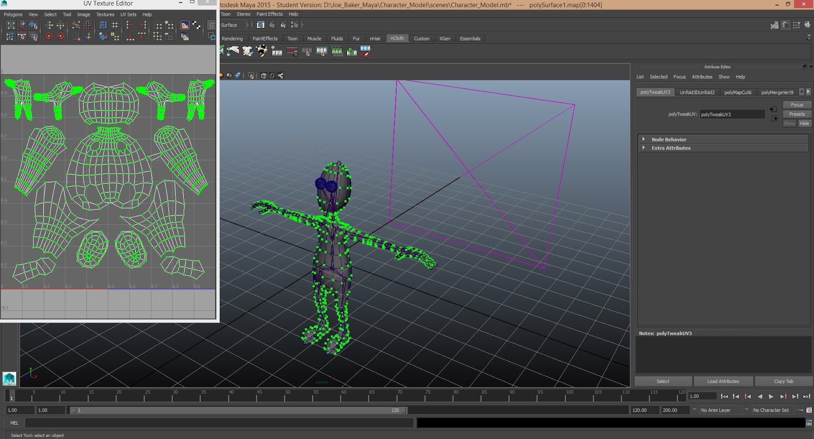
The next step was UV mapping the model. This again was a completely foreign concept at first but looking back now, it was relatively simple and just felt quite different because it's not something we had undertaken before. UV mapping allows you to explode the outer surface of an object in order to add colour or whatever design you like to the surface of a model. It uses a mixture of interfaces and functions in Maya in order to do this, including the UV map editor which is an essential tool when trying to obtain an objects UV. Once the UV is mapped you can import it into Photoshop and cover it in whatever design you like, before importing it back into Maya in order to rewrap it around the model, now with the design added.
Once the UV mapping is complete the main model is completed and the next stage involves creating the skeleton. This is done using the joint tool and is relatively simple in that it is a simple case of connecting joints to joints. The best way to think about it I think it to take a section at a time like an arm and work from the hand to the elbow, then the shoulder then the clavicle. Doing it like this makes it easier to keep track of what you've done and keeps things tidy. Then the next step is to create the controls for the model. The controls are the things that you move when your model is fully rigged and ready to be animated. They allow you to move individual limbs and sections of a model before key framing them. The way they are produced is using primitive NURBS, most commonly NURBS circle. These are shape outlines that can be moulded to fit the different sections of the model. Similar to when creating the model, the controls that can be copied over from the left and right are done on the left side first and then mirrored across. This includes the controls for the left foot, knee, leg, ankle, toe, hand, elbow, shoulder and clavicle. The central controls, that controlled the main body of the model included the head, neck, chest, back, hip and two central controls called the 'root' and the 'master controller', which moved the whole models body. The last stage of creating the controls is to colour code them. The central controls are made yellow whereas the left side is made blue and the right side red. These are chosen mostly due to their high contrast, so they are easy to distinguish from one another.
I think outside of the complexity of modelling objects, the next stage in the process is probably the most technically difficult part of the process. The next section encompasses orienting the different joins, creating joint hierarchy and joining the skeleton to the controls, and then to the mesh or model. Orienting the joints is so that the joints are angled at the correct direction to correspond the the other joints around it - and orient them in a straight line. This is done using the Constrain > Orient function. Next, is creating the joint hierarchy. This is quite simple but can be complex due to the amount of joints that have to be parented in a hierarchical fashion. For example, the hand joint would be parented to the wrist, which is parented to the elbow, and then to the shoulder and the clavicle. So using an arm as an example, it moves up in that kind of hierarchical fashion. This is done using the outliner as a tool, selecting the joint and pressing up before selecting the controller you would like to parent it to and hitting 'p' for parent. A similar process then has to be done by parenting the joints to the controllers. Once this is complete the rigging process is almost done and the skeleton just has to be binded to the mesh. Once this is done, the model is nearly ready for animating, and just needs one more process - which is the weighting.
The final step is adding the weightings to the model. The weightings are painting onto a model to determine the amount of influence a section has over others. For example, the foot should not have any influence over the arm when it's moved, and these weightings have to be done manually to determine in a way how you want the character to deform and move. I spend quite a lot of time on this section trying to adjust the weightings and then test the effect it had on the model. This idea of painting on the influence seemed quite strange at first but it was quite easy to get used to.
Overall, I learnt a huge amount about Maya and the development of characters through this process. I was also introduced to rigging and the method behind it in order to make it work as a fully functional character in terms of animation.
The first part of the study task was to model the demo character for scratch. In terms of the shape and complexity of the model it was quite simple but still needed to be approached in a thoughtful way or the model could easily go wrong. Furthermore, we had side and front reference imagery to work with and could shape the model in accordance with the images - so this made the task a little easier. I started with the main torso and body, followed by the legs and arms and finally the head. I thought doing it this way, and modelling in order of complexity it meant that I could get a feel for the software before I had to attempt something more difficult, the guides that Mat made for us were also in a similar order to this.
The next step was UV mapping the model. This again was a completely foreign concept at first but looking back now, it was relatively simple and just felt quite different because it's not something we had undertaken before. UV mapping allows you to explode the outer surface of an object in order to add colour or whatever design you like to the surface of a model. It uses a mixture of interfaces and functions in Maya in order to do this, including the UV map editor which is an essential tool when trying to obtain an objects UV. Once the UV is mapped you can import it into Photoshop and cover it in whatever design you like, before importing it back into Maya in order to rewrap it around the model, now with the design added.
Once the UV mapping is complete the main model is completed and the next stage involves creating the skeleton. This is done using the joint tool and is relatively simple in that it is a simple case of connecting joints to joints. The best way to think about it I think it to take a section at a time like an arm and work from the hand to the elbow, then the shoulder then the clavicle. Doing it like this makes it easier to keep track of what you've done and keeps things tidy. Then the next step is to create the controls for the model. The controls are the things that you move when your model is fully rigged and ready to be animated. They allow you to move individual limbs and sections of a model before key framing them. The way they are produced is using primitive NURBS, most commonly NURBS circle. These are shape outlines that can be moulded to fit the different sections of the model. Similar to when creating the model, the controls that can be copied over from the left and right are done on the left side first and then mirrored across. This includes the controls for the left foot, knee, leg, ankle, toe, hand, elbow, shoulder and clavicle. The central controls, that controlled the main body of the model included the head, neck, chest, back, hip and two central controls called the 'root' and the 'master controller', which moved the whole models body. The last stage of creating the controls is to colour code them. The central controls are made yellow whereas the left side is made blue and the right side red. These are chosen mostly due to their high contrast, so they are easy to distinguish from one another.
I think outside of the complexity of modelling objects, the next stage in the process is probably the most technically difficult part of the process. The next section encompasses orienting the different joins, creating joint hierarchy and joining the skeleton to the controls, and then to the mesh or model. Orienting the joints is so that the joints are angled at the correct direction to correspond the the other joints around it - and orient them in a straight line. This is done using the Constrain > Orient function. Next, is creating the joint hierarchy. This is quite simple but can be complex due to the amount of joints that have to be parented in a hierarchical fashion. For example, the hand joint would be parented to the wrist, which is parented to the elbow, and then to the shoulder and the clavicle. So using an arm as an example, it moves up in that kind of hierarchical fashion. This is done using the outliner as a tool, selecting the joint and pressing up before selecting the controller you would like to parent it to and hitting 'p' for parent. A similar process then has to be done by parenting the joints to the controllers. Once this is complete the rigging process is almost done and the skeleton just has to be binded to the mesh. Once this is done, the model is nearly ready for animating, and just needs one more process - which is the weighting.
The final step is adding the weightings to the model. The weightings are painting onto a model to determine the amount of influence a section has over others. For example, the foot should not have any influence over the arm when it's moved, and these weightings have to be done manually to determine in a way how you want the character to deform and move. I spend quite a lot of time on this section trying to adjust the weightings and then test the effect it had on the model. This idea of painting on the influence seemed quite strange at first but it was quite easy to get used to.
Overall, I learnt a huge amount about Maya and the development of characters through this process. I was also introduced to rigging and the method behind it in order to make it work as a fully functional character in terms of animation.
Subscribe to:
Posts (Atom)