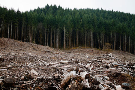

I spent some time collecting various imagery to draw from. The designs only had to be outlines but I think with a little more detail it can certainly up the quality of the overall animation. Through the detail of the silhouettes and cutouts we can create quite complex and interesting scenes. I was looking specifically at aspects of North American forests as they contain quite typical and generic looking trees that I think a lot of people can recognise and have seen before, however I plan to cut some tree designs from a rainforest environment when we get to developing that part of the project. After using this process last year I became of the benefits of using illustrator to create designs for cutting with a laser. Drawing with the paintbrush or paint tool on illustrator creates a path which acts as a vector, perfect for this because it can be resized accordingly without affecting the quality. It also has a nice smoothing option of the brush tool, making the lines less jagged and creating an overall nice line to be cutout of the paper. I did however turn the smoothing to its lowest setting so that the smaller details weren't lost when the smoothing was applied to the line, I found this worked a lot better and gave a better result. So I took the various reference images, also keeping in mind the original art style we wanted to achieve which was similar to that in 'Gravity Falls' where there is almost a flat aspect to the art style and started drawing the trees on illustrator. I used a mixture of pine trees with various tall thin trees I saw on other images and attempted to make them relatively detailed but also making sure they looked like trees and were easily recognisable in that sense. A technique that I discovered quite early was drawing half of a tree and then mirroring it so that it was the same on both sides. This, although not realistic looked quite nice and gave the designs quite an elegant look. I spent a day or two drawing out quite a few different designs for trees of different sizes and shapes coupled with grass and branches so as to increase the potential for different elements being brought in to the production.
When it came to the cutting of the designs, it was fairly straight forward. I purchased around seven or eight different pieces of coloured card from the library that suited the imagery which included a couple of different greens and browns, a dark washed out navy, white and a couple of others. These were about A2 sized so I knew that my designs would fit onto the paper as they were created in an A3 document. I turned my illustrator files into JPEGs and took them down to the laser cutting room. The software used to communicate the design to the laser cutter is called APS Ethos which I became quite familiar with thanks to the time I spend using it in the previous year. I loaded the card and opened my files. Problems with the laser cutter arise when the setting used to cut the specific material you need it to doesn't cut through correctly. On my first attempt, despite having it set to 'thin card' the laser didn't cut through the design all the way around and so I had to change the setting to 'thick card' for it to create a clean cut through the card with the design. The first few attempts at cutting worked really well and I was happy with how it looked. In reflection I also think that making the outlines slightly more complex really added to the visual appeal of the individual aspects. After two sessions on the laser cutter I had a reasonable amount of different assets, I think they totalled around 18 - 20 unique designs in varying colours. I scanned these in and placed the scans in the shared folder on google drive, so the whole group has access to them if they need them. Following this I decided to test a method of animation using paper. I drew out a 12 frame sequence of a bird flying and got it printed on the laser cutter, similar to the other assets I scanned them in and put them into After Effects where I created an animated sequence from the paper cut out of the bird, hopefully this can be done with other animals and aspects of the animation to create something visually complex and compelling.
The success of this approach has given me confirmation about the approach we're leaning towards and with some more thought and imagination I think this can be taken further. It is quite a reliable and cheap method. Combining this with the groups knowledge in post production and After Effects software I think we can make good progress and development within the project.


No comments:
Post a Comment